Form
Allows the construction of user interfaces through the combination of previously defined Drag and Drop components and the use of CSS, Angular JS, and JavaScript resources.
Characteristics
- Each form may contain one or more pages and each page has an HTML, an Angular Controller JS, and a collection of dependencies (Screen layout is common to all pages)
- The screen drawing contains a collection of lines and each line of the screen design may have one or more components (with one or more properties)
- Pages previously configured in the system:
- Default page
- A Page used, to start SM service, search the data inside the database, and register directly on it.
- CRUD page
- A Page automatically created by the business Object, with the basic functions
- Process page
- A Page for SM system processes associated with business processes used to Start a Lowcode Business Process.
- Task page
- Run through a created Workflow/ESI Design, rendering a Lowcode form on the ticket screen.
Before getting started
Must have the Lowcode Application created.
Procedure
- Access the functionality through navigation in the menu Lowcode > Management > Form;
- Click on "New";
- Complete the fields available for “Basic Data”, In this tab the user should inform the basic data of the forms, such as the Application to which the form belongs, the Name, Description, Business Rules (for Validation and for SM, if any) and the Folder, which is a physical form grouper on the server, for the purposes of organization and mark, if the Form is to be Show as an SM widget;
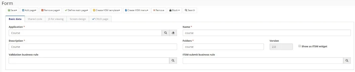
Figure 1 - Form
ATTENTION:
Version is incremented automatically by the system whenever a new version of the form is created.
- Add page
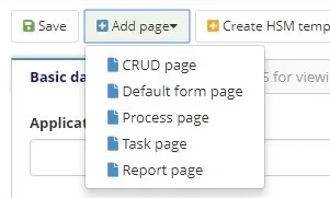
Figure 2 - Add Page
- The generated tabs will have the following structure:
- Properties: General data

Figure 3 - General Data
- HTML: page HTML structure

Figure 4 - HTML
- Controller: Controller Code referring to the Form
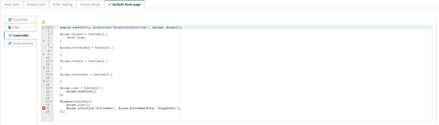
Figure 5 - Controller
- Dependencies: the dependencies of the application are reported. The name of the dependency and the path in which it is located must be entered. The user must also inform whether it will be injected into the controller.
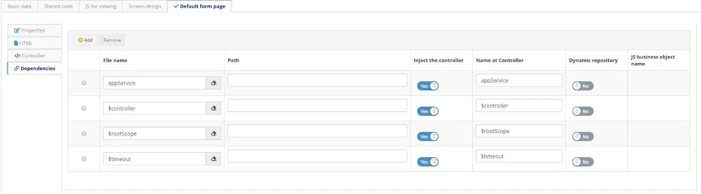
Figure 6 - Dependencies
- Design the screen, to create the screen design, click on Edit Screen or navigate to the system tab Screen Design that opens automatically:
- Drag the components located on the left side palette to the center of the screen according to the shape you want to build the form. The components are arranged in rows and columns, and the rows have a width of 12 columns. This means that in each line you can insert up to 2 components with width 6, or up to 3 components with width 4, for example. It is not mandatory to fill the entire row;
- You can also create tabs on the forms. To do this, go to the tabs menu, and choose tabs horizontally or vertically. The tabs will be added on the screen, and you can design the screen with the components on each tab.
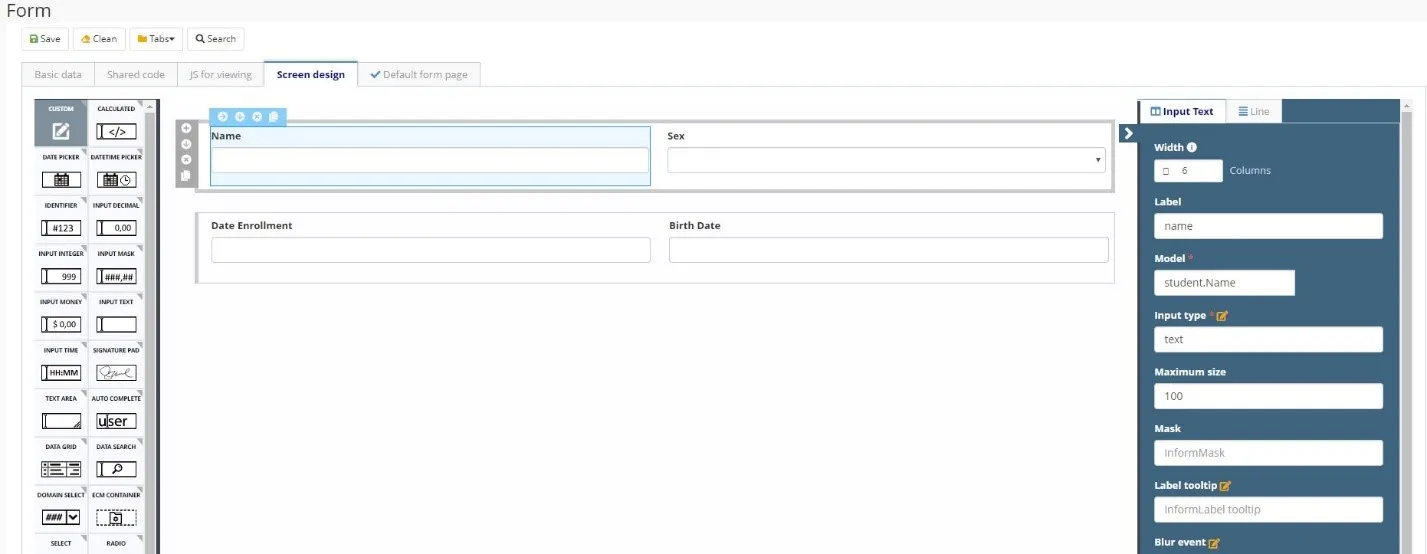
Figure 7 - Design
- Click on "Save" to run the changes. You can save it in the original version (current version), or in a new version.
JS for visualization:
This tab has the ability to add variables in the JavaScript scope on the screen that opens when you click the "View Screen" button. More information can be found in the Developing Applications.