Form
The form is how users interact with the application. It's created by combining "drag and drop" user interface components, CSS features, and JavaScript/AngularJS code.
- Each form can contain one or more pages, with each page having HTML code, an AngularJS controller, and a collection of dependencies
- The screen layout is common to all form pages and is built by dragging and dropping UI components
- The screen layout, designed in the Screen Design tab, contains a collection of rows where each row can have one or more UI components
- When adding any field, you can configure options for hiding, mandatory fields, editing, business rules, click actions, help text, JavaScript events, and rendering events
- Pre-configured system pages:
- CRUD Page - Automatically configured by the system during Business Object creation, providing CRUD (create, read, update, delete) functionality
- Default Page - Used to provide user data when creating incidents, requests, problems, or changes in Workflow and ESM
- Process Page - Used to start a Low Code Business Process
- Task Page - Renders a Low Code form in the incident, request, problem, or change ticket screen of Workflow and ESM
- Report Page - Integrates the form with system-generated reports, including specific dependencies for JASPER report execution
Forms can also be made available in Request or Incident Tickets, Problems, and Changes.
Before You Begin
You must have created a Low Code project
Step by Step
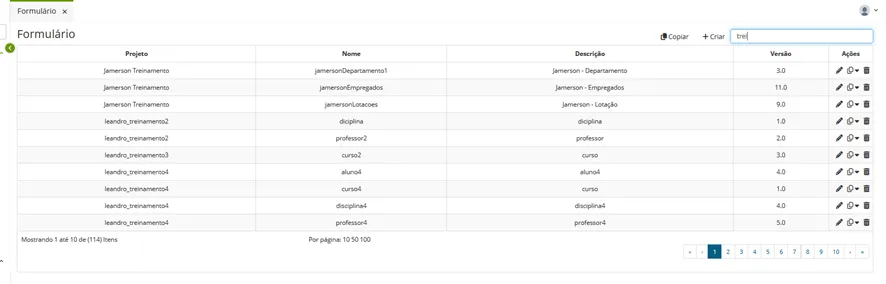
Access the functionality through the navigation menu Low Code > Management > Form
Click "Create";
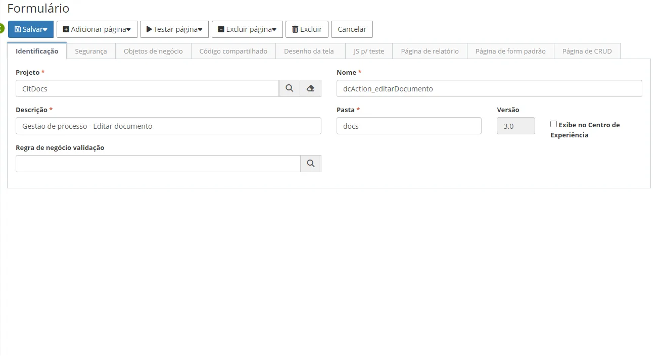
Complete the fields in the "Identification" tab:
- Name of the Low Code Project the form belongs to
- Form Name
- Form Description
- Folder where form configurations will be stored
- Validation Business Rule, if needed
- Check Display in Experience Center if you want the form shown in the experience center
✏️ Note: The company's internal system has the Experience Center page - the corporate intranet where news and relevant information are published. Checking this option will display the form within the Experience Center.
⚠️ Warning! The version is automatically incremented by the system whenever a new form version is created.
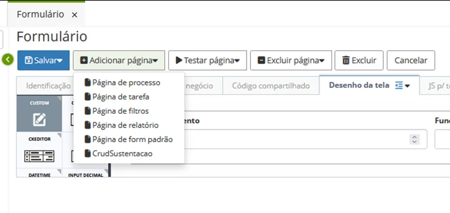
Add Page to Form
The types of pages you can add depend on the project type you're developing. For registration, add a CRUD page. For custom forms, add default form and task pages. For reports or filters, the same logic applies.
Form Tabs
Identification
General form data.
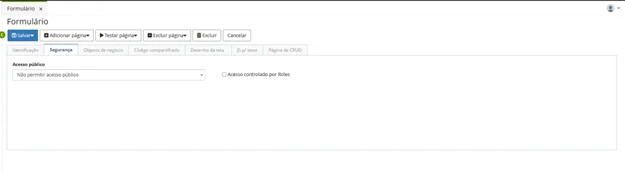
Security
Define who has permission to access the project.
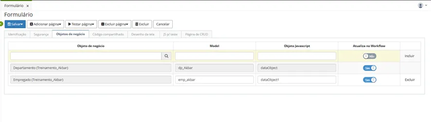
Business Objects
Where Business Objects are declared.
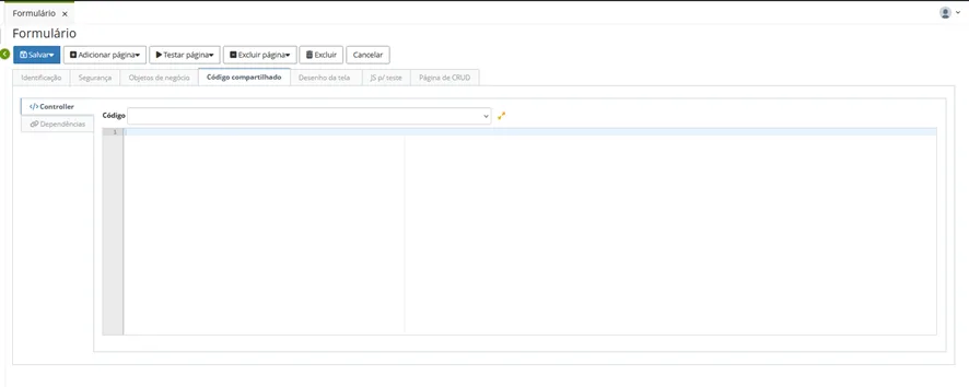
Shared Code
Where you insert code lines used commonly by all pages and can include dependencies that are custom code snippets (CSS and JavaScript).
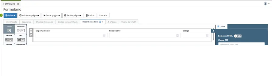
Screen Design
Where you insert components and objects related to form screen designs with inputs, selects, grids, buttons, checkboxes, options, custom HTML, etc. For more information see Screen Design.
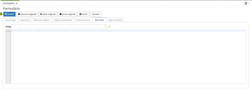
JS for Testing
Area for executing JavaScript code snippet tests.
Form Pages
Displays CRUD, Default, Task, and Report pages that are part of the project and have specific usage types depending on the project objectives as seen earlier.
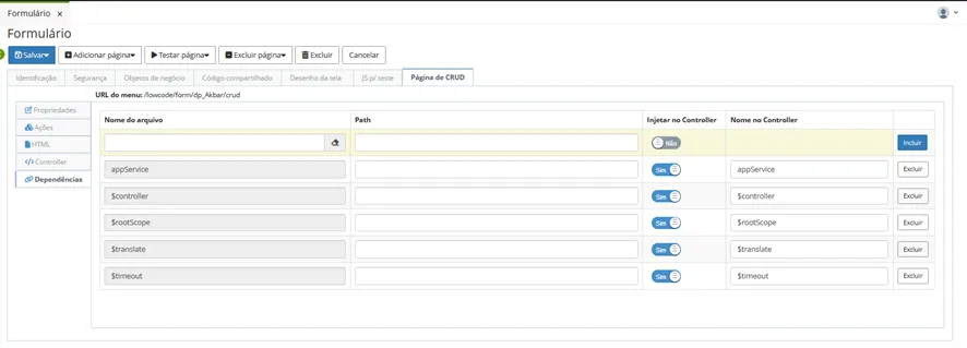
In this example we have configuration tabs for a CRUD page elements.
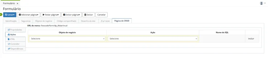
The tabs available for CRUD pages, default form, task, reports and filters will always have the same structure: URL, Properties, Actions, HTML, Controller and Dependencies.
Menu URL: Address for calling the form type;
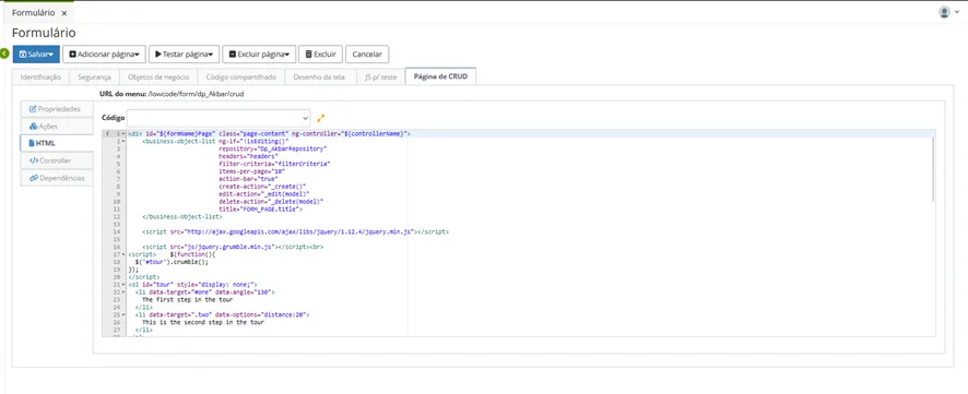
Properties: General repository data;
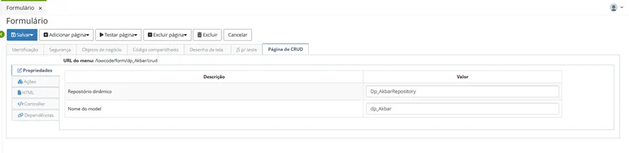
- Restore object when loading page;
- Save data before page submit;
- Save data after page submit.
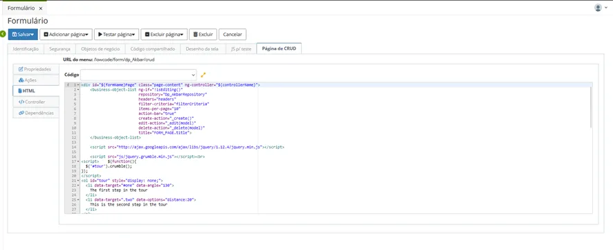
HTML: HTML page structure;
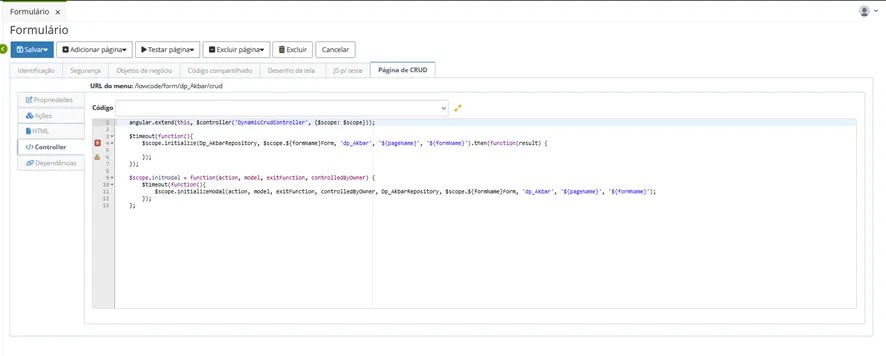
Controller: Form controller code. Codes inserted here will only execute on this page;
Dependencies: If the form needs external code, this code must be registered as a dependency. The dependency name, location path, and whether it should be injected into the controller must also be specified.
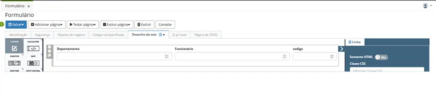
Designing a Screen. To create the screen design, click "Edit" or navigate to the system's Screen Design tab, which opens automatically.
Drag components from the left palette and drop them in the center. Components are organized in rows and columns, with each row having a 12-column width following bootstrap standards.
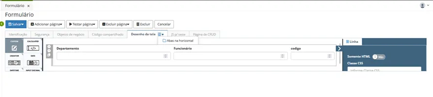
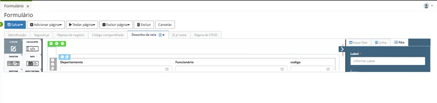
You can create Tabs for forms. To do this, go to the tab menu and choose horizontal or vertical tabs. Drag and drop components into tabs as explained above.